This post will describe how to create a block font using FontForge. We will look at the difference between full block and half block fonts. Also, my font needs to look like a stencil so we will look at how to do that.
Why am I doing this? I needed some very specialized characters to create decals for my Gilpin Tramway Ore Car models. The lettering was stenciled on the cars so the font characters need to include the stencil lines. If you’re interested in the reference books for historical information on the Gilpin Tramway check out this post.
Free Fonts
If you are looking for a block font there are plenty available. Just do a web search on “free fonts” and you’ll find lots of websites that supply fonts. Some will be free but others might only be free for personal use. I looked at a lot of block fonts mostly to see how they are constructed. You can open the font file in FontForge and look at how each letter is drawn. Anyway, I found some block fonts that were close to what I want, and some stencil fonts but nothing exactly matched what I needed. So I decided to create my own font.
Font Forge
FontForge is a free program that allows you to design your own fonts and generate font files that can be installed on your computer and used by any program that allows you to select a font. To learn FontForge I highly recommend reading the tutorial they provide (one of the best I’ve seen).
Full Block and Half Block
Before starting my font design, I spent some time researching “sign painting” by doing web searches on this topic. I specifically searched for books from 1890 to 1910 as this is the time period I am modeling. This led me to a book titled Lettering And Sign Painting with a copyright of 1901.
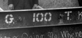
The photo above shows how the ore cars were lettered. It looks like a half block font, notice there are no curves, only straight lines. If you look at the width of the vertical line in the “0”, called the “stroke”, it appears the width of the entire character “0” is four “strokes”. Most of the characters in a half block font are 5 stroke widths tall by 4 stroke widths wide. A “Full Block” font on the other hand will be 5 strokes wide by 5 strokes high.
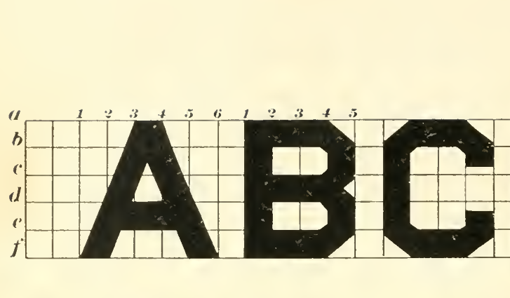
The figure above is a screen shot from the book linked to earlier. You can find this on page 134. If you look at the letter “B” you will see that it is 4 strokes wide. The “A” is an exception as are a few others like “M”.
Set Up Guidelines In Font Forge
Before actually drawing the glyphs in Font Forge I created a set of guidelines to define the 5 by 6 grid that each letter fits in.
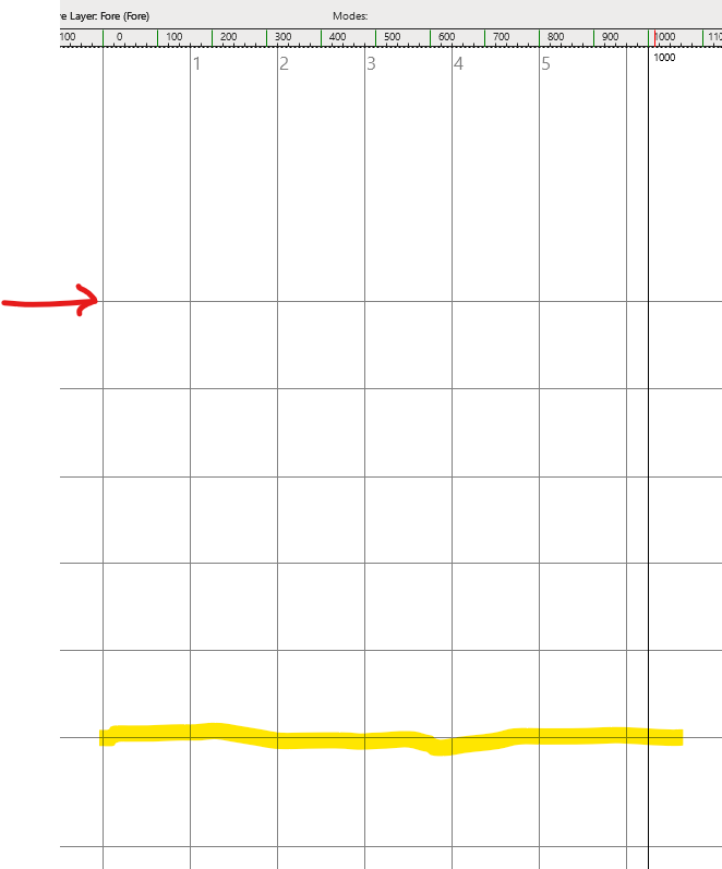
The screenshot above shows the FontForge glyph drawing screen. Nothing has been drawn yet but you can see the guidelines. The default grid, called the “em square” is 1000 by 1000 units. The yellow highlighted line is the default baseline so capital letters will sit on this line. That leaves 800 units above the baseline for the 5 rows needed by the block font. That’s 160 units per row. I added the horizontal lines shown up to the one with the red arrow. I also added the 5 vertical lines (numbered) which are also 160 units wide. This establishes the grid just like the grid shown in the book that we can use to draw the letters.
Draw The Glyph
I don’t need to produce the entire alphabet (thank goodness). I only need the letters “G” and “T” plus all 10 digits. Font Forge takes a bit of getting used to when it comes to drawing. If you have used a 2D sketch tool in a CAD package or are familiar with creating vector graphics in a graphics package that will help.
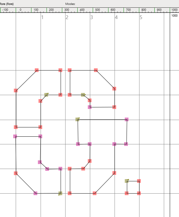
Here is the “G” drawn in FontForge. Notice how each part of the letter is one “stroke” wide. With the guidelines added, it is easy to draw the lines and snap them into the correct location. The angled lines for the corners are offset a little from the intersecting guidelines. I also measured the photo to see how wide the “stencil” lines are and ended up making them 60 units wide. Finally, notice that the “.” is included in the “G” glyph. I did this initially because I’m only ever going to type a G followed by a “.” in this font. However, this is being lazy, and I ended up removing the period from the letter G and adding a glyph specifically for the period. I then added two “kerning pairs”, one for the “G.” and one for the “T.” that shoved the period to the left so it would be snug up against the G or T. I also set the width of each character to it’s actual width plus one “stroke” or 160 units. This seemed to produce a good result when typing out different combinations of numbers.
Generate The Font
Font Forge creates and saves a font design file. You need to export the font to use it in another program. I exported my font as an OpenType CFF type font. You have to install a font file before you can use it. On Windows 11 this is easy, just right click the font file, click “more options”, and then click “install”.

Here’s a screen shot of a word document using my Gilpin Ore Car font. Compare this to the photo of the ore car shown earlier. It’s looking pretty good to me. My ultimate goal is to create decals that I can apply to my models of the Gilpin ore cars.
And Finally…
I hope you enjoyed this venture into how to create a block font using FontForge. I’m no expert on graphic design or font design but was able to overcome my limitations and produce the result I needed. If you are a model builder I highly recommend giving this a try the next time you need some unique lettering.